![]()
Color Design
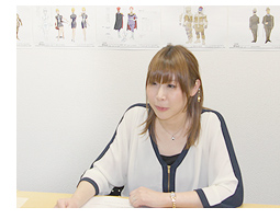
Nagisa Abe
Coloring is an aspect of animation that usually goes unnoticed, but actually plays a crucial role in expressing the "taste" of a work. How was the color scheme for "MOBILE SUIT GUNDAM THE ORIGIN" (hereafter referred to as "THE ORIGIN") settled on? We spoke to color designer Ms. Nagisa Abe about the use of color in "THE ORIGIN."
 Abe: After coming up with the basic colors, you have to think about colors that change with each scene of the story. For example, for a scene set at night or dusk, how do the colors of the skin and clothes change? That's related to the previous cuts, so I'm thinking about the color balance of the work as a whole. Also, once the artwork is completed, even once it's filmed, when image processing begins the hues will change, and I have to fine-tune for that too. So I'm involved for a very long period, from the very beginning to the very end.
On the other hand, we used a lot of military-style colors too. I consulted with Mr. Imanishi, who aspires to realism in those matters, and the setting was very specific so I made sure to follow that image exactly.
When I read the original manga, I personally envisioned a dark color tone and coloring dark scenes is my forte in the first place, so I assumed it would be dark coloring. While reading the manga, in my own mind I had attached colors with a dark feel to the drawings. But when I got into the actual work they asked me for bright, pretty hues, so I was a little bit lost and it took some work to replace my own ideas of it. So my impression of the early stages was that people would repeatedly say my work was "dark" when I presented work, and I would always be told "brighter."
As for the CG mecha, Mr. Imanishi said, "It's CG so you don't need to worry about the number of colors." So I looked at plastic models for reference, and put in lots of detailed color distinctions.
Coloring has a closely linked relationship with the dramatic elements, so I based my work on the opinions of Mr. Yasuhiko, Mr. Imanishi, and Episode Director Mr. (Kiyoshi) Egami – three people responsible for the dramatic direction of the work. For instance, they might say, "This is a sad scene so go with dark hues." Also, my own tastes enter into it, so there's the question of how to represent a happy medium between those opinions that complies with the directors' intentions. So it's natural that there end up being a lot of colors.
Also, I was very conscious about coloring for the posters on this project. For episode one, the basic color is "red," and in the middle you have the visual of Char standing there. A person in red clothes, surrounded by red. Mr. Imanishi and I went back and forth about that many times. For the posters, for episode 2 onward as well, I think the colors will be presented such that you can tell which episode is which by that color. If I may repeat what I said earlier, we placed much attention on making it Yasuhiko-like, and we went for a balance of colors so that people watching it for the first time could easily get into it, so it would please me if people noticed that. I don't often get the chance to talk about the thought behind color design, so if they look for the things I talked about here, I think they will be able to see the work in yet another way.
Next time in our series of relay interviews will be SF setting consultant Mr. Shikano.
- How did you come to be involved with "THE ORIGIN"?
Abe: I was told by the producer that they were working on a project of "THE ORIGIN." I absolutely wanted to do it, so I was put forward as a candidate. I've always loved the Gundam series, and I was involved in the color design of "MOBILE SUIT GUNDAM SEED DESTINY" in a secondary role. I've also been in charge of painting copyrighted illustrations and things. I always thought I'd like to be involved as color designer myself on a Gundam-related project someday, so I was completely into it.
- In concrete terms, what does being in charge of the color design process actually involve?
Abe: Put simply, it's the job of thinking up and putting in the colors of skin and clothes and machinery once the line drawings of the characters and mecha are done. Of course, I can't just do as I please. I have discussions with the director about his vision for the work as I'm deciding on them. On this occasion, I based my work on the illustrations and color art by Mr. (Yoshikazu) Yasuhiko, and in cases where the colors weren't determined I spoke with Mr. Yasuhiko directly, asked him about his image of them, and then added in my own preferences as well. That's kind of how the work went.
- With the screenplays and the character and mecha designs, they're done with the work fairly early on. But with color design, even after the basic designs are done, your work isn't finished yet, is it?
 Abe: After coming up with the basic colors, you have to think about colors that change with each scene of the story. For example, for a scene set at night or dusk, how do the colors of the skin and clothes change? That's related to the previous cuts, so I'm thinking about the color balance of the work as a whole. Also, once the artwork is completed, even once it's filmed, when image processing begins the hues will change, and I have to fine-tune for that too. So I'm involved for a very long period, from the very beginning to the very end.
- With an original work, the colors are decided from scratch, but in this case you had Mr. Yasuhiko's source manga, so was it easy to envision the hues?
Abe: Actually, that was a very difficult aspect of it. If I worked from the color illustrations, I could simply go with that vision, but Mr. Yasuhiko mixes various paints together to get his colors, so they're not the kind of simple colors we use in anime. He also makes bold changes to the hues depending on how a scene is depicted. So it was difficult to decipher what colors Mr. Yasuhiko wanted to express things with. I was able to ask him directly about things, but if he said, "I'm not particularly attached to any color for that," then I often struggled to make a judgment. For the time being, I would do the coloring based on my own ideas which I would then show to Director (Takashi) Imanishi, and then Mr. Yasuhiko would give the final confirmation. That was the flow of the work. The colors were determined with total coordination, while preserving the images everyone has of the characters Mr. Yasuhiko drew.
- Does "THE ORIGIN" have an overall color tone?
Abe: Mr. Imanishi said, "Episode 1 has a dark tone, including the backgrounds, so I want to avoid an overall somber and dark taste in the color tone." So I made the coloring of the characters one tone brighter than the backgrounds, so they pop out against the backgrounds. Also, they said they wanted the colors to appear pretty. Pretty doesn't necessarily mean bright, so I was careful about the balance there.On the other hand, we used a lot of military-style colors too. I consulted with Mr. Imanishi, who aspires to realism in those matters, and the setting was very specific so I made sure to follow that image exactly.
When I read the original manga, I personally envisioned a dark color tone and coloring dark scenes is my forte in the first place, so I assumed it would be dark coloring. While reading the manga, in my own mind I had attached colors with a dark feel to the drawings. But when I got into the actual work they asked me for bright, pretty hues, so I was a little bit lost and it took some work to replace my own ideas of it. So my impression of the early stages was that people would repeatedly say my work was "dark" when I presented work, and I would always be told "brighter."
- What about the color tone of the mecha, which were created with CG in "THE ORIGIN"?
Abe: On this project, we chose color tones in a way that would blend the characters and mecha. We didn't just suddenly decide on the modeling data colors. I colored the line drawings and once the color tones were fixed, then we added the modeling colors. For example, in "MOBILE SUIT GUNDAM" (First Gundam), pink was the basic tone of Char's Zaku. But Mr. Imanishi and I both looked for a more realistic direction, and Mr. Yasuhiko also gave us the OK, so we went with a dark red that would be less conspicuous on a battlefield. With the Black Tri-Stars' Zakus, too, we went from the black and purple to colors with a realistic feel.As for the CG mecha, Mr. Imanishi said, "It's CG so you don't need to worry about the number of colors." So I looked at plastic models for reference, and put in lots of detailed color distinctions.
- Were you conscious of the color tone of First Gundam, which this was based on?
Abe: I looked at the old materials, and made a presentation saying: "It used to be like this, but how about if we do it like this this time?" Basically, we compared it to the past works and considered it that way. At that time, the number of paints available was limited, and the number of colors was very limited as well. But now having gone digital there's no limit to the number of colors we can use, so if we arrange things in a modern style, how will that change things? I did some thorough thinking over various aspects of that.
- Were there more colors compared to other projects you've been involved with?
Abe: In terms of the work, overall I think it feels like it has a bright color tone, but in each scene the colors undergo fine changes, so there may be a few more colors than usual. Mr. Yasuhiko's thinking was: "When you enter a room, if it's lit, then the base coloring should be different." So basically the feeling was that we fine-tuned the colors to go with the backgrounds in each instance.Coloring has a closely linked relationship with the dramatic elements, so I based my work on the opinions of Mr. Yasuhiko, Mr. Imanishi, and Episode Director Mr. (Kiyoshi) Egami – three people responsible for the dramatic direction of the work. For instance, they might say, "This is a sad scene so go with dark hues." Also, my own tastes enter into it, so there's the question of how to represent a happy medium between those opinions that complies with the directors' intentions. So it's natural that there end up being a lot of colors.
- Thinking about the flow of directorial give-and-take and so forth in order to decide on the colors is quite difficult, isn't it?
Abe: On this subject people often say it's very difficult, but for me it is very fun. "THE ORIGIN" is a major title, and of course in terms of the work parts of it are extremely difficult, but I've wanted to work on something related to Gundam for a long time and I quite proudly wonder if I'm having more fun than anyone else on this job. (laughs)
- For the overall work, what kinds of things do you really focus on with the color design?
Abe: I wanted to express the sense that it was Yasuhiko-like. Only, when you follow through on what is "Yasuhiko-like", you envision the color illustrations that Mr. Yasuhiko has drawn, and those are very difficult to depict in anime. Therefore, I was careful to try to balance an old-time feel with modern digital, so that old fans who watch it with nostalgia and new fans who are getting their first taste of Mr. Yasuhiko with this work can both feel good watching it.Also, I was very conscious about coloring for the posters on this project. For episode one, the basic color is "red," and in the middle you have the visual of Char standing there. A person in red clothes, surrounded by red. Mr. Imanishi and I went back and forth about that many times. For the posters, for episode 2 onward as well, I think the colors will be presented such that you can tell which episode is which by that color.
- Is that connected to the bright impression that can be seen through the work as a whole?
Abe: I think so. If you have continual dark scenes, it often becomes hard on the eyes in the latter half. We made the colors so you can watch the show without straining, and you can watch it through to the end and feel fine, I think. We didn't simply go in a bright direction with the color tone. It's finely balanced, and it was very hard to get the colors to look pretty. Mr. Imanishi himself had strong ideas about the coloring, and was more clear in stating his opinions than other directors. He said, "Color is an important part of the work," and I was grateful to him for understanding that.
- As the color designer, what would you like people to watch out for in "THE ORIGIN"?
Abe:  If I may repeat what I said earlier, we placed much attention on making it Yasuhiko-like, and we went for a balance of colors so that people watching it for the first time could easily get into it, so it would please me if people noticed that. I don't often get the chance to talk about the thought behind color design, so if they look for the things I talked about here, I think they will be able to see the work in yet another way.
 Next time in our series of relay interviews will be SF setting consultant Mr. Shikano.

